27 Best Home Builder Website Designs in 2026
Did you know home builders are one of the most popular trades online? Given this demand, it’s crucial for home builders to have a professional website to attract customers. In this article, we’ll dive into the top website designs for home builders in 2026.


Having a professional, high-quality home builder website design not only lets you highlight your services and showcase your work, but it also helps you stand out from your competitors online. When you invest in a professional, user-friendly home builder website, you can generate more leads, increase your brand recognition, and boost your sales.
The key to creating a great home builder website is working with a talented and professional web designer who understands the qualities needed to make your website attract new customers and make a good first impression.
Whether you’re interested in creating a website from scratch or redesigning the one you already have, read this guide to the best home builder website designs of 2026.
Key Components of a Superior Home Builder Website Design!

A Website Design That Stands Out
The last thing you want is for your website to get lost in the mix or overshadowed by your competitors, so you must ensure your site stands out from the rest. The goal is to create a well-organized, user-friendly website that encourages your customers to contact your business, regardless of whether you provide remodeling services or heat pumps.
Do some competitor research to gain some insight into what other home builder websites are doing, so you can be sure your site includes all the appropriate elements and then create a better website design.
Professional Project Photos and Videos
Having a professional portfolio is one of the most important elements to your home builder website.
We highly recommend you invest in your portfolio assets by hiring a professional photographer to capture your completed jobs. Cell phone photos and low quality work images aren’t going to cut it if you want to stand out online.
The most visited page on a home builder website is the portfolio, so make sure it reflects your work in the best way possible.
Trust Signals
You can tell your customers how great your business is, but what really helps is seeing and hearing it from your customers.
Consider syncing your Google Business Profile reviews to your website and display them in a prominent location on your homepage and in the navigation. Don’t put your reviews on the bottom of the page hoping people will scroll and see them.
If you don’t have a Google Business Profile, we recommend you start one asap, its free and the most important platform for reviews.
Showing off your experience and expertise is another way to build credibility. As you’ll see in some of the examples below, many home builder websites highlight their years of experience, number of jobs completed, and awards and accolades to demonstrate their impressive track records.
User Friendliness & Call to Action
Visitors to your website want to get in and get out—they don’t have time to waste clicking on every tab and scrolling around your site until they find what they need. That’s why it’s crucial to make an easy-to-navigate site with calls to action that help direct your visitors, clearly defined pages that provide helpful information, and mobile-friendly features for convenient browsing on cell phones.
Optimized for SEO
When you hire a web designer to build your website make sure they include onsite search optimization as part of the project.
The important onsite SEO elements you want included with your website design are:
- Page Load Speed: Your pages need to load fast and under 3 seconds.
- Keyword Research: You need to know what keywords your pages should be optimized for.
- Meta Tags: You need meta title and meta descriptions written on every page of your website.
- Proper H Tags: Your pages need to have a single H1 tag and multiple H2 and H3 tags.
- XML Sitemap: You need to make sure your website includes an XML sitemap.
- URL Structure: Your website should use proper url structures to help the search engines understand the structure of your website and content.
How to Choose a Website Designer?

Specialization
While there are a lot of website designers out there, choosing one who specializes in your industry can make a big difference because they already understand your business and pain points and your customer needs. With this foundation, your website designer can get to work ensuring your website has the appropriate features that will attract the right kind of customers and achieve your website goals.
Marketing Expertise
Your website isn’t just showcasing your brand; it’s selling your brand. That’s why it’s important to hire a website designer who has marketing expertise so they incorporate the elements that can help improve your conversion rates, such as including clear calls to action, enhancing brand recognition, and featuring engaging content.
Good Values
Just as with any business relationship, you want to partner with someone who has good values. This means finding a respectful, responsible, and trustworthy web designer who is not only open and honest with you but also honors ethical practices and accessibility standards when it comes to website design.
Competitive Pricing
It’s not worth sacrificing quality and functionality to save a few bucks. As tempting as it may be to go with the cheapest website designer you can find, it’s best to select one who has competitive prices and a track record that justifies those rates.
Hiring a website designer who has competitive rates doesn’t have to mean overpaying for services; it just means paying a reasonable amount in exchange for quality work.
How Much Do Home Builder Websites Cost in 2026?

Yes, you can find some website designs charge as little as $500 and some that cost as high as $35,000, but we don’t recommend going with either of those extremes. The sweet spot is around $3,500 to $6,500, which should get you a professional website that doesn’t use templates or cookie-cutter designs.
When shopping around, it’s best to avoid website design services that only charge a monthly fee for the website, since you’ll never actually own the website. Once you cancel your monthly subscription, you’ll have nothing to show for the money you spent on the website.
Understanding the Web Design Process

Planning & Visual Sitemap
When designing a home builders website, the first step involves planning and creating a visual sitemap. During this stage, your web designer will work with you to create the structure of your website so it aligns with your business goals and objectives. A visual sitemap is like a blueprint for your website as it provides a visual representation of all the pages and how they are interconnected.
Kick Off & Assets
Next, you’ll complete a kick-off document with all the important details about your home builder business, from your services to your unique selling propositions. At this stage, you’ll also share all your assets, like your logo files, work images, videos, and copy through a custom file-sharing portal, Dropbox, or Google Drive.
Design
During the design phase, your website designer will begin bringing your ideas to life. Your designer will start with the homepage design and then invite you to review the design, provide feedback, and request any changes. After making all the necessary revisions and receiving your approval, your designer will move on to the other pages of your website.
Keep in mind that some web designers charge for every round of iterations or design changes, so it’s best to work with a company like Contractor Gorilla, as we offer unlimited revisions at no additional cost. This helps ensure you’re 100% happy with your website design.
Build
With the design stage complete, it’s time for your website designer to start building out your website. Your website designer will create the website on a testing site which not publicly visible. Once they’ve developed your website, they’ll share the testing link with you to review the site.
Content Finalization
Next, you will work with your designer to finalize any written content and images on the pages. With all the copy and photos in place, you can begin testing your website to ensure it looks and functions as you’d expected.
Go Live—Hosting & Management
Once you give the thumbs up, it’s time to launch your home builders website live. If you’re hosting it yourself, you’ll provide your designer with access to your hosting, but if your designer is hosting the website, you’ll give them access to your domain name account.
Once your website is live, you’ll want access to your content management system to manage and maintain it. In some cases, your website designer may offer maintenance services and do updates for you.
Best Home Builder Website Designs in 2026
E2 Homes

The E2 Homes site lets its work speak for itself, as this design invites visitors to explore their masterful designs right off the bat. We like that you can scroll through each design and click on “view build” to see more details about the craftsmanship. Although the discrete side navigation bar icon on the left does have the potential for getting overlooked, we appreciate how it expands to provide a more detailed version of the truncated navigation bar in the top right corner.
Schumacher Homes

The Schumacher Homes web design’s homepage features a video clip front and center, which shares Paul Schumacher’s personal story of how he got involved in custom building. We thought this was a nice touch as it reveals the human side to the business. The “where we build” feature was another notable element on the site, as it includes an interactive map with pins, showcasing locations, contact information, hours of operation, and directions, making it easy for the visitor to find service in their area.
Stella Doma

While some websites go a little overboard with their interactive features, Stella Doma tastefully uses a zoom out effect when the visitor scrolls down the page. What starts with some high-quality imagery gives way to supporting text in an artful, yet professional manner. Aside from the creative interactive features, we appreciate how the site provides an informative “how it works” section, clearly outlining the process in four easy steps, along with a detailed view of the floor plans and specs.
Connect Homes
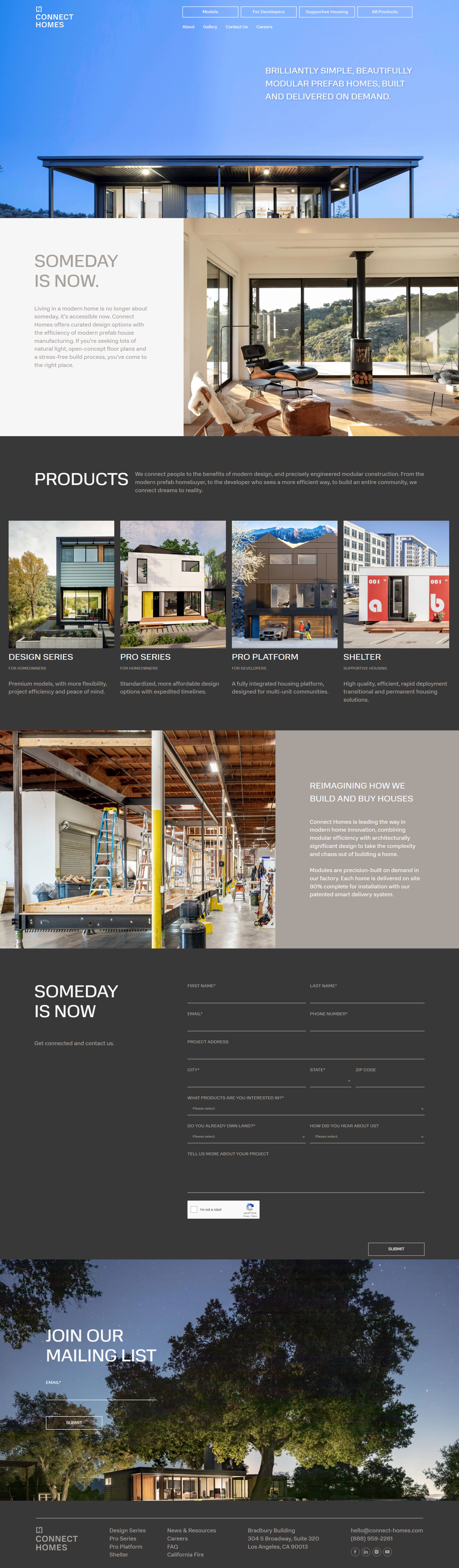
“Brilliantly Simple” are the first two words on the Connect Homes homepage, and the entire website encompasses that sentiment, from the imagery to the descriptions. This website exudes a sense of simplicity, as it encourages its visitors to consider the ease of investing in modular prefab homes. We also thought the website did a good job of displaying its four designs with short descriptions and clickable images that navigate to a more in-depth guide with additional models, stats, and details.
Arrowwood Custom Homes

While many other home building sites choose to include images of their model homes in their banner, the Arrowwood Custom Homes decided to use a blueprint of a home instead. We celebrate this design choice as it really speaks to what the company offers. The website also uses what looks like hand-drawn floor plans to showcase their designs rather than using glossy digital models. This further gives this company a rustic, authentic feel, differentiating it from its competitors.
Bill Huey + Associates

The Bill Huey + Associates homepage forgoes a hero image and instead opts for a montage of images that take up the entire background, making the visitor pause for a minute to take in the awe-inspiring, dreamy homes and their interiors. The website features a portfolio icon overlaid on top of the moving images, further inviting the visitor to explore their impressive collection of designs. Because the photos are clearly the star of the show, we appreciated how the website included a dynamic menu bar that stays in the center of the left-hand side so as not to get forgotten.
Sims Luxury Builders

While many of the home builder website designs on our list are image-heavy, the Sims Luxury Builders site does a great job of balancing photos with text. The site introduces the company and provides details about what it offers alongside striking images of its work. We are also fans of the sticky navigation bar that remains at the top of the screen no matter where the visitor is on the site, so it’s easy to navigate to other pages like their contact form, blog, and service offerings.
Sina Homes

Admittedly, we were a bit surprised to see the Sina Homes website lacking imagery up front and center, but it intrigued us enough to explore the rest of the site. In place of images, this website leans heavily on large text, which clearly denotes the company’s story and process. We also have to give this website props for simplicity, as its navigation bar only includes four pages: about us, past projects, upcoming projects, and contact us, providing an easy-to-navigate user experience.
Wardell Builders

The Wardell Builders website features clear calls to action, which include learning about their open positions, receiving an initial consultation, and contacting the business. We always like when a company does this as it helps nudge the visitor in the right direction. The other thing that stood out to us on the homepage was the use of numbers to denote the company’s experience and expertise, such as the number of custom homes and remodels they’ve built, years in service, and awards and accolades.
Jenkins Design-Build

Professional, sleek, and lavish are just a few words that come to mind after viewing the Jenkins Desing-Build website. The high-quality drone videos elevate the homepage and accentuate the brand’s luxury designs, from the marble floors and infinity pools to glass ceilings and legendary views. In addition to the captivating images, we like how the homepage features client reviews, accolades, and years in business to further highlight the company’s expertise. The elite website experience is clearly a reflection of the company’s caliber.
Medallion Home

Some home builder websites might feature a few images or even a short drone clip, but the Medallion Home homepage includes an entire tour of a property, making visitors feel like they’re walking through the home themselves. While the immersive banner video is certainly the star of the show, there are a few other notable features on the homepage, including interactive messaging and texting choices, the “shop available homes” call to action, and the accessibility menu with options to alter the page to accommodate different visitor needs.
Schaeffer Homes

The Schaeffer Homes website is all about the visitor experience, providing the tools they need to do business with this company. For starters, the homepage includes a handy chat feature that automatically pops up in the bottom right-hand corner. Just below the centerfold, there’s a search bar inviting the visitor to fill in their market, county, and price range, followed by an interactive map feature that provides details about areas with available properties. Even the language on the website suggests that the visitor is at the center of it all, with phrasing like “you choose,” “you pick the home,” and “your dream home starts here.”
Patterson Custom Homes

We appreciate how the Patterson Custom Homes website teases you with some sleek, professional drone footage in the hero slider, but what we really like is that the homepage is informative above all. Below the centerfold, there’s a video clip introducing the company with the option to click the icon to learn more. As the visitor scrolls further down the page, they find descriptions of the process and preventive home maintenance program. Without even clicking their mouse, the visitor can easily gather a high-level understanding of what this brand offers.
Drexel Luxury Homes

The Drexel Luxury Homes website is another great example of a brand that gets straight to the point. In the hero image, the company wastes no time briefly explaining who they are and what they offer. As visitors scroll down the homepage, they receive more information about the company and featured projects, along with an invitation to download the company’s guide to designing a new home. We also approved of the business including its brand differentiators, as that wasn’t something we had noticed many other home builders doing.
Cornerstone Homes

While design and imagery are often the most important elements of a home builders website, we can’t overlook the importance of well-written content. Perhaps what we like most about the Cornerstone Homes homepage is the compelling tagline over the hero image, “We bring you home.” Not only is it an invitation to partner with the brand, but it also ties in the housing imagery. We also thought it was a smart move to include the “as seen in” banner, showcasing the company’s recognition by prominent outlets.
Rainier Custom Homes

The Rainier Custom Homes homepage features a “tell us about your project” call to action above the fold, welcoming the visitor to fill out a handy contact form with details about their vision. But perhaps what we like most about this site is that it’s simple and straightforward. Below the fold, the company includes a short and sweet mission statement followed by a link to learn more about the team, a collection of awards it received, and some glowing client reviews. At a quick glance, the visitor can easily grasp what this brand is all about.
Jay Marc Homes

Because some home builders websites go a little overboard with their moving images and video footage, we liked how the Jay Marc Homes has an image carousel that the visitor can manually scroll through themselves, with their calls to action layered on top of each frame. We’re also fans of the crisp and clean design that’s a breeze to navigate. Furthermore, we thought the video clip featuring real client testimonials was a nice testament to the kind of work this company produces.
Montana Build

The Montana Build website brings the drama! We love how the professional imagery is juxtaposed against the black background with bold white font, creating a sense of confidence and competence. We also like how clutter-free the homepage is as it features a “view portfolio” call to action, a short description of the brand, and a series of alluring images followed by their locations and a contact option. Visitors can find everything they need without having to click on every tab.
Stokkers + Company

While it does run the risk of looking too cluttered, the assortment of photos of designs on the Stokkers + Company homepage actually does it a favor. Because the high-quality imagery is so appealing and the homes are so impressive, it flaunts the company’s skill and eye for design. The images are the main focus, so we appreciated how the clean white background and unassuming gray text complemented the photos without competing for attention. Also, we applaud the company for including information about their green initiatives, as this is an important differentiator that sets them apart from the competition.
Belmonte Builders

We like it when a website gets straight to business, and that’s exactly what the Belmonte Builders website does, as it features a handy search bar front and center. The visitor can immediately use the dropdown menus to select their preferences and generate results. Additionally, we approved how the visitor can manually scroll through the image carousel in the banner to browse the company’s unique selling points paired with photos of their work. Other notable features included the dynamic call to action button for signing up for the newsletter and the “discover more” section with clickable tiles to the community, gallery, and blog pages.
KRM Custom Homes

The downloadable free homebuyer’s guidebook pinned to the left-hand side of the KRM Custom Homes website was the first thing that caught our eye. Not only does it pop against the homepage, but it’s an interesting differentiator that we didn’t see other competitors offering. The next thing that stood out to us was the use of blocky design for text boxes and images and the gray and white color scheme that matched the home interiors, creating an aesthetically appealing website viewing experience. Because the colors were otherwise muted, the maroon call to action, which perfectly matched the logo, was easy to find.
Cullum Homes

While we would have liked the dramatic drone footage in the banner to be at a slightly slower speed, we can’t deny the impressiveness of the designs captured in the imagery. Between the grandiose landscapes, fancy cars, and extravagant interiors, it’s clear that the Cullum Homes brand is a step up from the rest. This website is a textbook example of how investing in quality video and photos can elevate your website experience. Above all, this website design is sharp, polished, and professional, delivering an experience that is likely as elite as the work the company provides.
Desert Star Construction

The Desert Star Construction website is a lesson in the power of simplicity. The homepage features a statement photo followed by some simple text over a white background and a few examples of their work, making it a pleasure to navigate without facing too many bells and whistles. We also like how the homepage includes a “watch our story” button with a video that pops out only after the visitor clicks on it, helping to keep the design clutter-free. As a bonus, we thought the highlight reel of the company’s news appearances was a modest nod to the brand’s clout in the industry.
Weaver Custom Homes

We couldn’t help but notice Weaver Custom Homes is one of the few websites on this list that took advantage of the sticky navigation bar so the company’s phone number is always visible in the top right-hand corner, so the visitor doesn’t have to click every tab to track down their number. We also found that this brand packs a lot onto its homepage but that it’s done so in a tasteful way that doesn’t feel overwhelming. We like how the company included its values and a short questionnaire to help point the visitor in the right direction based on their needs and preferences.
Bontecou Construction

Again, simplicity for the win! The Bontecou Construction website takes a simple, clear, no-frills approach that proves less is sometimes more. The homepage features a moving image carousel with a handful of stunning images, a short blurb on the company, and a few project examples—and that’s it. Even the navigation menu is straight to the point, offering only what’s necessary for the visitor: about us, projects, services, press, contact, and client portal. Visitors can come to this website and find exactly what they want without sludging through unnecessary elements.
Gateway Construction

The Gateway Construction website is another example of a homepage that provides a lot of information upfront at once. That said, the block design divides each section, making it easier for the visitor to digest it all and navigate at their own pace. Because there is a lot to explore on the homepage, we appreciate how the brand features three calls to action in the banner, creating a good starting point for a visitor who may need a nudge in the right direction. Top of it off, the badge on the banner was a nice touch, as it called out the company’s recent accolade.
Fortin Construction

We’re all about celebrating brands that do something unique with their imagery, so it only makes sense to call out the innovative photos on the Fortin Construction site. The images on the homepage combine blueprints and real images of homes, creating an accurate yet creative representation of what the company offers. Furthermore, we like how the homepage includes a detailed description of their services, followed by several clickable examples that lead to full pages dedicated to each service.

Aaron R. - CEO
Entrepreneur with 20 years experience launching and managing successful web design and marketing companies. As seen in New York Times, Inc.com, Smashing Magazine, Home Advisor and other various mainstream media.
Passionate about #seo #marketing #webdesign #socialmedia #blogging #family #texasbbq
"*" indicates required fields