Best Construction Website Designs for 2026
Two decades ago, you could get away with using a cheap (or free) online website builder to write some text and add a few grainy pictures, a list of services, and your contact information to make a construction website.
As one would expect, you have to do a lot more than that today to be considered professional. There are many contractor companies like yours today that are competing to get business from your target audience, so you want your contractor website to convince your visitors that you’re the right person for the job.
In this article, we’ll cover:
- Must-have website design elements for construction websites
- Important pages that construction websites should have
- Real-life examples of some of the best construction websites on the web
What website design elements are a must-have for construction websites?
When designing a construction company website, there are certain design elements you should include to help your visitors get the full experience of your business.
Here are the most important design elements you should prioritize:
1. Navigation bar

Whether it’s at the top of your homepage or on the sidebar, construction company websites should have a navigation bar that directs visitors to the most important pages that contain information about the business.
While the pages you link to in your navigation bar may vary, most construction websites have important links to their About Us/Company, Service, Portfolio, News, and Contact pages. These pages reflect information that most people want to know when they land on a construction company website.
2. Large header photos

Most, if not all, construction websites have large header photos right underneath their navigation bar (if it’s located at the top of the homepage). This photo(s) usually represents your best work and shows visitors, at a glance, what kind of construction work you do. This way, they know what to expect as they explore your website.
While some companies use only one header photo, it’s better to rotate the photos (3-5 images are fine) so that your homepage won’t look stagnant and boring. If you have a good video the header is the perfect location to place it. Videos add a modern feel to your website and engage users.
3. Social media icons / links
Many construction experts have started recognizing how powerful social media is for marketing your company. So if you’re not on social media, sign up for two or three platforms — preferably Facebook, Instagram, and Twitter. But don’t just stop at creating accounts.
Include the links to all your social media pages in the header and/or footer of your website. This way, when visitors come across your website, they’ll be able to connect with you on those platforms and get updates whenever you share articles or news about your business on social media. Your social media pages also drive traffic to your website and make you appear more professional.
4. Professional work images

To show your visitors just how good you are at your work, you’ll need to include pictures of finished projects on your website. You shouldn’t, however, use pictures taken with subpar smartphones.
Your website will look more appealing and professional if you use images that are high-quality and taken with good cameras. That’s why you should hire a professional photographer to spend a day or two taking images of your best-completed projects to add to your portfolio. These images set you apart from your competitors, increase your credibility, and give potential customers a great idea of your accomplishments and work culture.
5. Mobile-friendly web design

Throughout Q4 of 2022, 59.16% of internet users used mobile devices to visit websites. In light of this, you should make your construction company website responsive across all devices — including mobile devices. The term ‘responsive’ means that your website is designed to adapt to any screen size, be it a smartphone, tablet, laptop, or desktop computer.
If your website doesn’t load fast and display properly on mobile devices, you’ll likely miss out on customers who used their phones to visit your site. In addition, Google predominantly uses the mobile version of a site’s content to index and rank it. So having a mobile-friendly website can increase your ranking in search engine results pages (SERPs).
What pages should your construction website have?
1. Portfolio / Project Gallery

The importance of a portfolio or project gallery on a construction website cannot be emphasized enough. This page extensively covers the best work you’ve done for previous clients — complete with professional looking before/after pictures of the area, the scope and timeline of the projects, and explanations of the work you did to renovate the place.
A portfolio/project gallery shows prospective clients real-life proof that you have the necessary skills and abilities to do what they need to be done. It also gives them inspiration and helps them become more creative with what they want their own spaces to look like.
2. Reviews / Testimonials

While it is good — recommended, even — to sprinkle testimonials on all your major web pages, you should create a dedicated page where you compile the most in-depth and punchy reviews and testimonials you’ve received from happy clients. You can talk all day about how top-rate your services are, but if there’s no proof that previous clients were happy with your work, prospects may not want to hire you.
According to BrightLocal’s Local Consumer Review Survey 2026, 46% of customers trust testimonials as much as personal recommendations from family and friends. So not only do positive reviews from past clients build your credibility, but they also convince prospects to work with you.
3. Services

Construction, in itself, is a wide field and it’s very rare to find a company that specializes in all aspects of construction. That’s why it’s important to have a page that clearly states the services you offer and the kind of clients you’re looking to work with.
As you describe the services you offer, include photos that represent each of them. This helps potential clients figure out if you’re able to do the job they want to hire a construction company for.
4. About Us / Company

5. Contact

The end goal for all construction company websites is to convince clients to hire them. But prospects can’t reach out to you if you don’t have a contact form they can fill out. So set up a web page with a form that prospects can fill out to get in touch with you.
As mentioned earlier, many construction companies put a link to their Contact page on their navigation bar. You should also place links to your contact form on each subpage of your website to shorten the buyer cycle.
Construction website designs updated for 2026
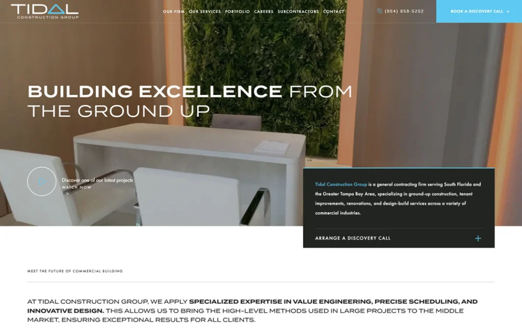
Tidal Construction Group’s website stands out in 2026 for its clean, modern design, intuitive navigation, and strong focus on user experience. The homepage immediately communicates professionalism with high-quality visuals and a streamlined layout. Service offerings are clearly defined, and the portfolio showcases real project outcomes, helping build credibility. The site emphasizes collaboration and client satisfaction, reinforced by testimonials and a smooth contact process. Mobile responsiveness, clear calls to action, and a dedicated subcontractor section round out a well-executed digital presence that effectively supports both lead generation and brand trust.
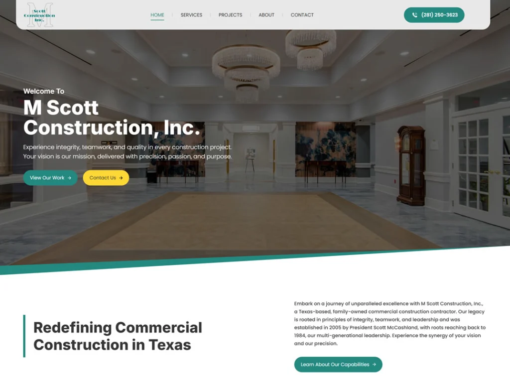
M Scott Construction’s website exemplifies modern construction web design in by combining clean aesthetics with user-centric functionality. The homepage immediately communicates professionalism through high-resolution imagery and a streamlined layout. Services are clearly defined, highlighting the company’s expertise in commercial construction, including projects for schools, assisted living facilities, and retail spaces. The portfolio section showcases completed projects with detailed descriptions and visuals, reinforcing credibility. The site emphasizes client collaboration and satisfaction, featuring testimonials and an intuitive contact process. Mobile responsiveness ensures accessibility across devices, and clear calls to action guide visitors effectively. Overall, the website’s design and content reflect current best practices, making it a benchmark for construction company websites in 2026.
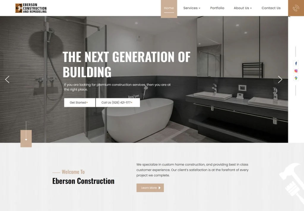
Eberson Construction and Remodeling’s website stands out with a clean, straightforward layout that quickly communicates credibility and experience. The homepage uses large visuals and simple messaging to highlight the company’s focus on home additions, remodels, and custom builds. Service pages are well-organized with concise descriptions that make it easy for potential clients to understand what’s offered. The project gallery provides real-world proof of their work, and testimonials add a personal touch without feeling forced. Mobile optimization is solid, and clear contact options help move visitors toward taking action. It’s a well-executed site that puts clarity and trust at the forefront.
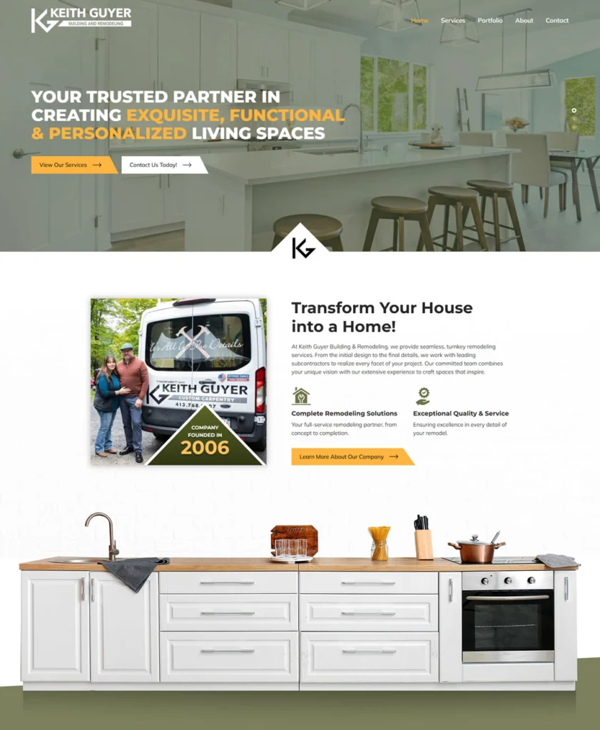
Keith Guyer Building & Remodeling’s website offers a straightforward and user-friendly experience that aligns well with current expectations for small construction businesses. The homepage presents a clear overview of the company’s services, emphasizing their turnkey remodeling approach and collaboration with trusted subcontractors . The portfolio section showcases a variety of completed projects in areas like Greenfield, Amherst, and Northampton, Massachusetts, providing potential clients with tangible examples of their work . The site’s design is clean and navigable, ensuring that visitors can easily find information about services and past projects. While the website doesn’t incorporate advanced features or interactive elements, its simplicity and clarity effectively communicate the company’s offerings and commitment to quality craftsmanship.
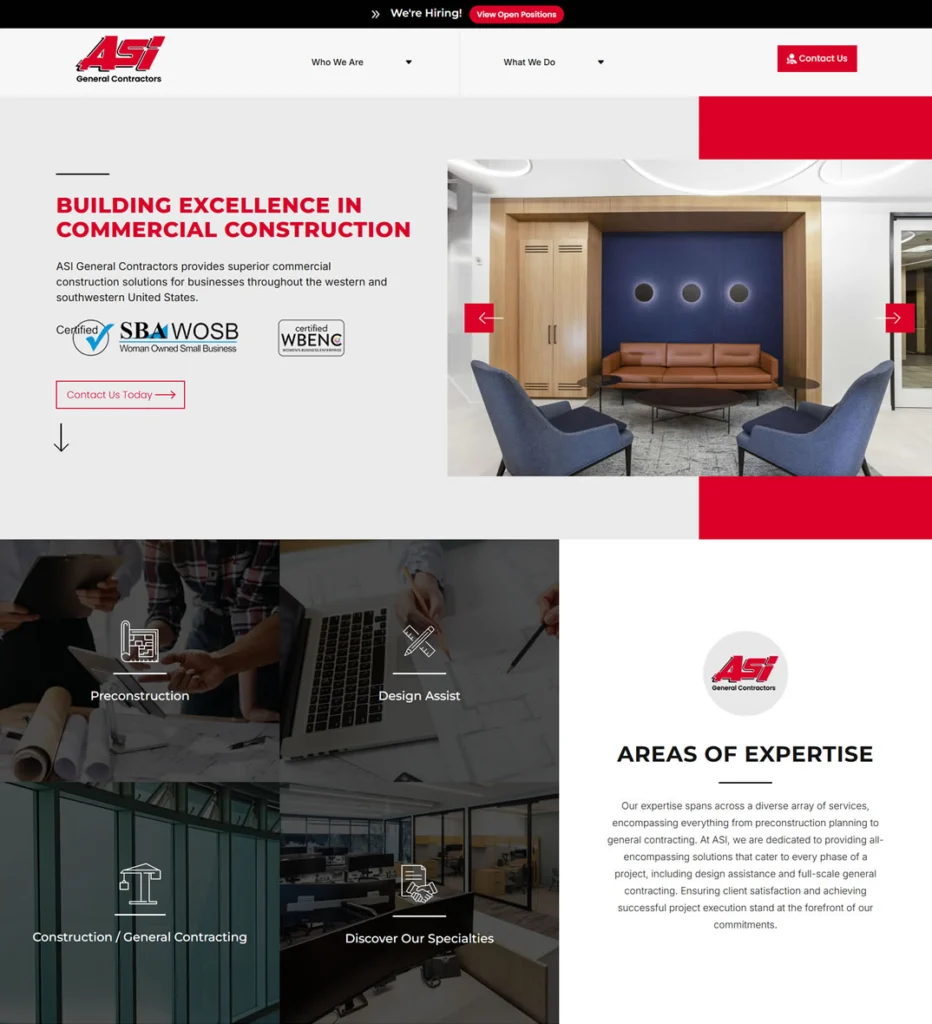
ASI General Contractors website delivers a polished, business-focused experience tailored to commercial clients and industry partners. The homepage presents a clear value proposition, emphasizing the company’s expertise in sectors like banking, healthcare, and federal projects. Navigation is straightforward, guiding visitors through services, project portfolios, and company information without unnecessary distractions. The site highlights ASI’s commitment to quality and service, reinforced by their WBENC certification and a history dating back to 1976. While the design is clean and functional, it avoids overused design trends, focusing instead on clarity and professionalism. Overall, the website effectively communicates ASI’s capabilities and reliability in the commercial construction industry.
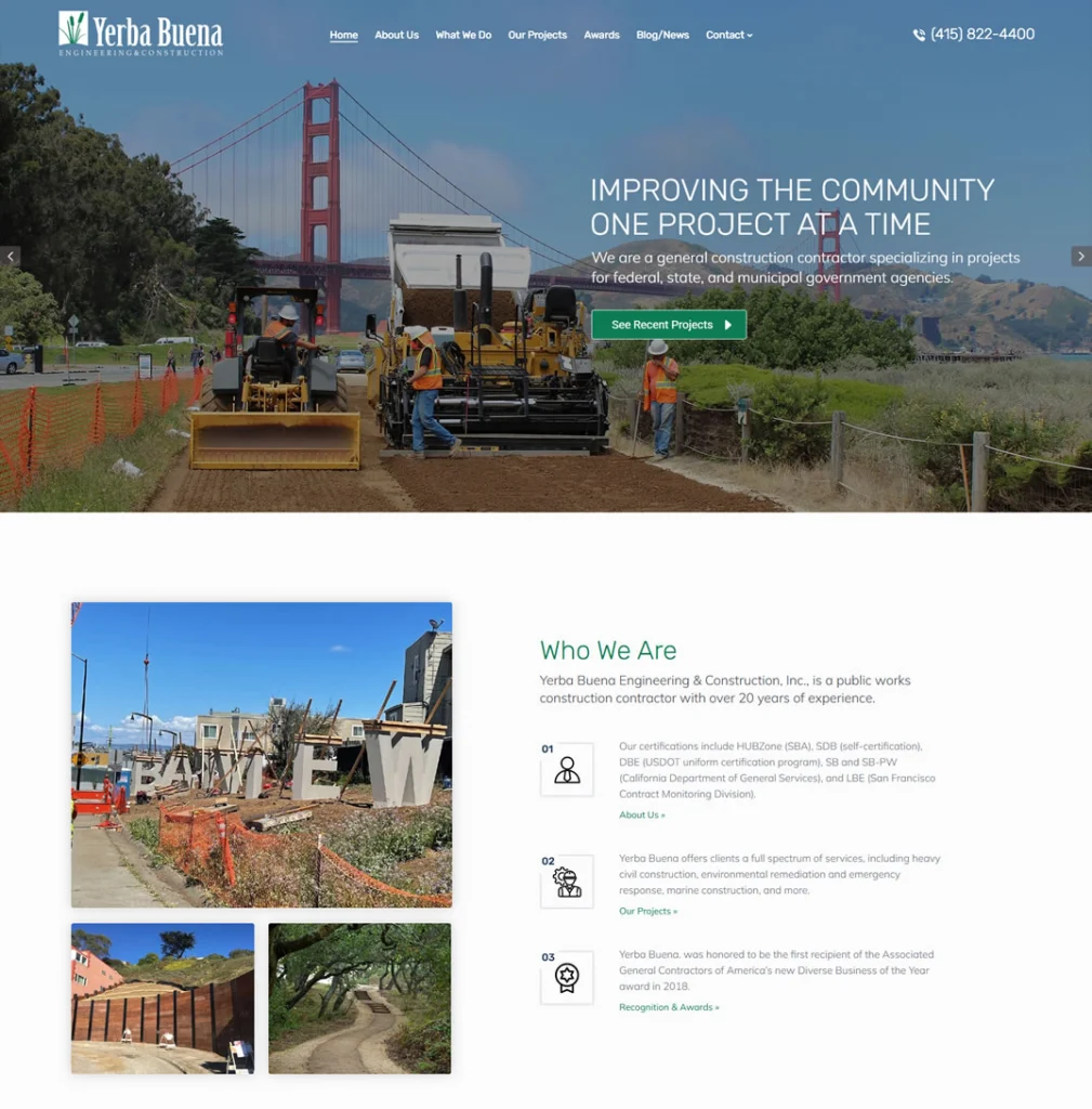
Yerba Buena Engineering & Construction’s website offers a streamlined and professional design that effectively communicates the company’s expertise in public works and infrastructure projects. The homepage features a straightforward layout with high-quality visuals, including images of ongoing projects, which immediately convey the company’s active role in community development. Navigation is intuitive, allowing visitors to easily access information about the company’s services, such as heavy civil construction, environmental remediation, and emergency response. The site also highlights Yerba Buena’s commitment to quality and safety, showcasing their experience with complex projects in challenging environments. While the design is clean and functional, it avoids unnecessary embellishments, focusing instead on clarity and professionalism.
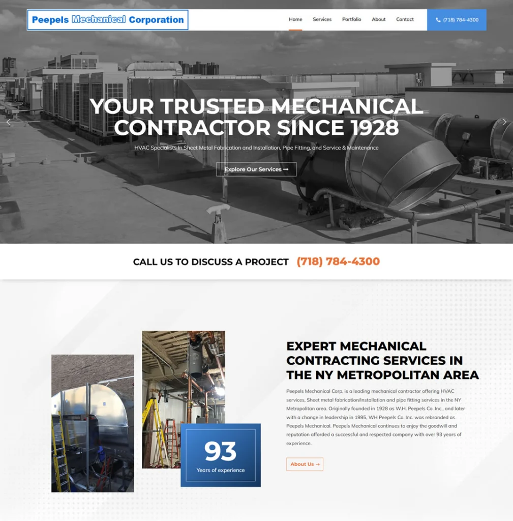
Peepels Mechanical Corp.’s website presents a clear and professional design that aligns with the company’s long-standing reputation in the mechanical contracting industry. The homepage immediately communicates their extensive experience, stating “Your Trusted Mechanical Contractor Since 1928,” which establishes credibility and trust with visitors. The site’s design is straightforward, featuring intuitive navigation that allows users to easily access information about the company’s services, including HVAC maintenance, metal fabrication, and mechanical installations. High-quality images of past projects provide tangible examples of their work, reinforcing their expertise and attention to detail. Additionally, the website highlights Peepels Mechanical’s in-house sheet metal fabrication capabilities, emphasizing their comprehensive service offerings. The contact information is prominently displayed, facilitating easy communication for potential clients.

Mehrer Drywall’s website delivers a polished, well-structured design that highlights the company’s legacy and capabilities. The hero section immediately communicates trust with the statement “Building Excellence For Over 60 Years” paired with an interactive video. The layout balances strong visuals with informative content, making it easy for users to understand their specialties in metal stud and drywall systems, design-assist, and specialty finishes. Stats and affiliations are used strategically to build credibility without overwhelming the visitor. Clear calls to action, contact information, and a modern mobile-responsive design all contribute to a site that feels current, professional, and built with the end-user in mind.
A quick look at the top 18 construction website designs

The entire homepage of Kiewit Corporation’s website is a beautifully curated rundown of the most important aspects of the business. The page starts off with large header photos that change after a couple of seconds. Overlaying these beautiful pictures is a quick blurb of what Kiewit Corporation is, what they do, and the ideal clients they serve.
Right underneath the fold, there’s a snippet of Kiewit’s history and some numbers that show how much money they made in the past year, their number of employees, and their ranking on ENR’s list of top 400 contractors. These numbers serve as social proof to their visitors that the teams at Kiewit are construction experts.
Below that, we see sections about working at Kiewit, the work that Kiewit has done for past clients (which leads to their portfolio gallery), Kiewit’s full history, and the latest news on what they’ve been up to construction-wise.

Bechtel’s homepage is a masterclass in navigation. At the top, you can see the navigation bar that has all the necessary pages including Who we are, Projects, What we do, Newsroom, and Contact among others.
Above the fold, there’s a large header photo with overlaying text that gives an announcement of what the Bechtel team is doing. While the announcement is vague, the red button that had LEARN MORE written on it is pretty hard for interested visitors to ignore. Right underneath the announcement, there are more links to the Services, Careers, and Recent Projects — which is smart as those links aren’t present in the navigation bar.
Next, we have a section that covers the latest news about Bechtel and its recent work. Right underneath the news section is information on how you can contact teams at Bechtel, complete with the addresses of all their branches across the world. They even provide information for visitors who want to be Bechtel suppliers.

Right at the top of Skanska’s website are two navigation bars — one small, one big. The big one draws attention to the two most important pages on the website: What we deliver and Who we are. These are arguably the only information a client wants to know before they hire you.
Skanska did a smart thing by rotating its main focus points at that moment above the fold of the website. Superimposed over six sliding header photos are the main things Skanska wants their visitors to notice: hiring new employees, connecting with an industry leader, rebuilding an iconic structure, giving to communities in need, celebrating a project completion, and the emergence of a robotic assistant.
To emphasize how important hiring new employees is to them, Skanska put more information about the open positions in the company right underneath the fold. They also touch on their approach to sustainability, and Diversity and Inclusion (D&I). There are links to articles from their News page and an extraction of their most recent tweets.
Turner Construction Company (TCC) took a simplistic approach to web design with its blue-and-white color palette. Just like Fluor, the Turner website is straight-to-the-point with only three sections: the header, the feature projects, and the news & announcements. The reason their homepage is scanty becomes obvious when you hover over the Our Experience page on the bigger navigation bar.


The first thing that stands out to me on Re-Bath’s website is its cohesive and visually stunning color palette. White and blue are reserved for website copy while deep red is used for CTA buttons and some parts of the website that Re-Bath wants its visitors to notice right away.
Below the stunning, on-brand header photo, there’s a quick summary of Re-Bath’s value proposition — free design service, quality materials, professional installation, and long-term warranties. Next, you’ll find the ratings that previous customers have given Re-Bath on platforms like Facebook, Houzz, HomeAdvisor, and Google. As though that’s not convincing enough, Re-Bath sprinkled sliding testimonials from past clients.
Re-Bath proceeds to have a collage of their past projects. There’s no accompanying text because Re-Bath allows stunningly professional pictures to do all the talking. There is, of course, a link to their portfolio.
Re-Bath revisits customer reviews, but this time they don’t use written testimonials; they use video testimonials that feature the clients themselves giving a play-by-play of the entire construction process. This gives visitors an intimate look at how the Re-Bath team works and the results they’re able to achieve.
Our favorite part of this website, though, is the Tips & Trends section where they share SEO-optimized content that works well for a content marketing strategy. These posts can also be shared on social media, in newsletters, and on other channels to increase exposure for the company.

ABC Seamless’ website starts off with a two-level navigation bar that has 12 links. These are a bit too many, so Seamless put indicators on its most important pages: a yellow lightbulb next to the Store Locator link and a phone number written in bold yellow right next to the Contact Us link.
Just like Re-Bath, ABC Seamless uses a captivating black, grey, and bright yellow color palette that draws the visitors’ attention toward the calls-to-action. That’s why visitors can notice the sidebar menu on the left side of the site that groups Seamless’ services into categories.
Right under the navigation bar is a form visitors can fill out to get a free product quote. The company goes on to tell visitors to use their Design Tool to visualize how their products will look in the visitors’ homes. This unique tactic gives people a way to envision exactly what they want and helps them believe that Seamless can get the job done. Only then does Seamless give visitors its history and brand story.
At the bottom of the website, visitors can find Seamless’ project gallery and make the decision to hire them (or not).

Dreammaker’s navigation bar is a thing of beauty. There are just five links that tell visitors all they need to know about the business. But Dreammaker specifies their services above the fold and encourages visitors to “start a conversation” with them.
Underneath the Services section of the site is a strip that invites visitors to read the latest guide on Dreammaker’s blog. Like Re-Bath, this indicates that there are pieces of content on this site that can be used to boost its exposure through content marketing.
Towards the end of the homepage, Dreammaker has a bigger form that implores visitors to get in touch with them. And beneath the form is a strip of the awards and accolades that this company has gotten, which shows visitors that this company is well-recognized for its expertise in the industry.
9. Connect Homes

‘Ethereal’ is the word to describe Connect Homes’ website. Unlike the convention website, this one doesn’t have header photos. Instead, it takes a minimalistic approach to describe the company and its processes.
Above the fold, there are three slides that succinctly explain how easy it is for prospects to come up with an idea based on Connect Homes’ pre-designed home models. On the left side of the page is the navigation bar with the linked web pages listed vertically.
At the bottom of each section is a small arrow that, when clicked, will take you further down the website. On the second slide, visitors are encouraged to explore how Connect Homes works in more detail. And on the final slide, visitors can enter their emails and join Connect Homes mailing list to receive updates.
One thing we love is that the sidebar navigation stays fixed as the user scrolls, allowing for easy access to different pages on the website. It’s quite clear that this company doesn’t rely on a content marketing strategy to get exposure. Instead, it nurtures prospects through email marketing and gets them to convert.
10. Reborn

With Reborn’s website, we revisit the trusty white, blue, and red color palette. First, Reborn uses deep red to draw attention to their phone number in the neat two-level navigation bar. There’s also a red Schedule an Appointment call-to-action that catches the eye instantly.
Superimposed on the header photo is a form that visitors can fill out to request a design consultation. Below that, Reborn aims to convince visitors that there’s no better time than now to partner with them to improve their homes.
The section below focuses largely on Reborn’s two-tiered services, which include cabinetry solutions, bathroom solutions, window solutions, and remodeling solutions. This section does a great job at explaining exactly what Reborn specializes in and how they can tailor their services to the prospects’ needs.
Further down the page, you’ll come upon Reborn’s project gallery where you can view the work they’ve done for past clients. Next, they show some numbers that prove how good they are at their work: 600+ experts at your service, 38 years of home remodeling, and 50,000 projects successfully completed for happy clients.
Then they finish things off with the high ratings they received on platforms like Facebook, Google, Houzz, and HomeAdvisor.

VINCI has a beautifully constructed navigation bar that takes visitors on a journey from getting familiar with the history of the company and what it does to the news about its most recent projects.
The homepage itself is compact with only the Join Us, Our Commitments, and News sections on it. The designers of this site used whitespace to draw visitors’ attention to the parts of the sites that are important.
An interesting part of the website is the strip that allows visitors to use filters to check for specific projects that VINCI has executed in certain countries. Visitors can find these projects by choosing a category, a subcategory, and a country. When they find the project, they’ll be able to read more information about it.
On the footer of the website are links to VINCI’s Facebook and LinkedIn profiles, which gives visitors a chance to engage with the company on social media. This cross-communication strategy helps the business build an organic following and increase brand awareness.

On this website, Tutor Perini uses sliding header photos to show prospects just how complex the work they do is. This is reinforced by the overlaying text: Extraordinary Projects, Exceptional Performance. Underneath each photo, you can see the addresses of the structure as well as how much money Tutor Perini spent to construct it.
Because Tutor Perini’s clients are government or private bodies that can afford to shell out millions — and even billions — of dollars on their projects, it doesn’t have a blog populated with SEO-optimized articles. Instead, it has pages dedicated to the industries it specializes in as well as a detailed menu of the projects it undertakes.

The teal-and-orange color palette combined with the professional pictures and whitespace makes this one of the most aesthetically-pleasing websites on this list. The stars of the site, however, are the interactive design tool and an integrated project gallery.
With the interactive design tool, prospects can design their own bathrooms however they want and use that as inspiration if they decide to hire Bathfitter. This way, they don’t have to imagine what they want their bathroom to look like; instead, they can try different colors, layouts, and materials, and choose the model that matches their taste best. And since Bathfitter created the tool, prospects are convinced that the company will be able to execute the models they make.
To prove that its teams are experts at bathroom designs, Bathfitter incorporated a portion of its project gallery on the website. These stunning pictures show the spaces that Bathfitter created, often featuring smiling people (which gives off the impression that Bathfitter’s clients are happy with the finished work). When you hover over the pictures, you’ll find links to share the pictures with others via Facebook, Twitter, Pinterest, and email.

The opening animation on all of PCL’s web pages is captivating and immediately grabs the visitor’s attention. The site itself takes visitors on a short journey that, by the end, makes them understand what PCL is all about and more importantly, what PCL can do for them.
PCL uses the area above the fold to show people its most impressive projects and innovative solutions. It goes on to explain what PCL is at its core and the beliefs on which it operates.
Under that, PCL uses a map to show where its offices are located across the United States, Canada, Australia, and the Caribbean Islands. If you have many offices worldwide, this is a great way to help visitors visualize how easy it is to physically get in touch with your company.
Next, PCL goes into more detail on what it does, the industries it specializes in, and the kinds of projects it takes on. There’s also a project showcase that breaks down the entire process PCL used to execute some of its monumental projects. PCL also includes some of its featured stories about huge projects and concludes the homepage by urging visitors to either “Build a project with us” or “Build a career with us”.

The second you land on this website, the unique font choice stands out to you. This helps create a strong sense of identity and differentiates Restore Tactics from its competitors. There’s also a well-designed lead form at the top of the homepage that implores prospects to get in touch with Restore Tactics’ team to discuss their needs.
Below the fold are different sections that cover what Restore Tactics does, some reasons why people should work with the company, the services it offers, its history, and some testimonials from past clients.
The Services section, in particular, is very comprehensive. Not only are there separate pages for each service offered, but each of those pages explains what the service entails and how prospects can contact the team and receive a service estimate. The pages also reiterate the reasons why prospects should hire Restore Tactics for their construction needs.
16. Jova Construction

The brand cohesiveness of Jova’s website is through the roof. Everything from the color palette to the font and the brand voice permeates through every web page on the site so visitors get a seamless experience the entire time they’re on the site.
The navigation bar is neat and clearly shows the aspects of the business that are most important — the portfolio, the About page, their services, and how prospects can reach them.
Above the fold, Jova immediately gives prospects a reason to trust it by referring to itself as the “one-stop shop for your construction projects”. It proceeds to give reasons why it’s so good, including its team of PMP project managers and carpenters, its state-of-the-art client communication system, and two decades of top-notch construction work which prospects can see in the portfolio.
Jova proceeds to share a bit of its history and its services, encourages visitors to get a quote, and includes the logos of clients that have partnered with it in the past. The website ends with reviews from happy clients.

The green-and-white color palette and use of whitespace make Webcor’s website well-organized and visually appealing. Above the fold, there’s a focus on Webcor’s value proposition, job openings, the completion of their headquarters renovation, and their newest project.
Under the fold is a section that summarizes Webcor’s areas of expertise, including project and construction management, preconstruction, construction, and self-perform group.
Below that is Webcor’s masterfully curated project gallery with each project put into one of several categories, including aviation & transportation, education, federal & government, hospitality, residential, and even parking structure. So instead of going through a myriad of photos looking for a past project that’s similar to what they want, prospects just have to click on the category they’re interested in and view similar projects immediately.
Right before the footer, there are glowing testimonials from Webcor’s past clients, which shows prospects that they can trust this company to do a satisfactory job. On the footer itself, there are links to Webcor’s LinkedIn, Instagram, Facebook, and Twitter pages — which encourage cross-channel communication.
While the beautiful red-beige-green color palette and greyscale photos on McCarthy’s website draw a visitor’s attention, the real appeal of the site is its granularity.
Instead of jam-packing the site with all the information they have to share, they used several layers of navigation to present this information in a granular way, with major categories like Projects, Locations, and Client Experience.

The site is so well-organized that visitors can get the right information very quickly.
McCarthy also makes it easy for prospects to familiarize themselves with the company through the project gallery, news articles, and videos about its work culture on the site. At the end of the homepage, there are links to McCarthy’s Contact form and social media profiles, including Twitter, Facebook, YouTube, and LinkedIn.
"*" indicates required fields
Construction website design key takeaways
1. Keep it simple
Construction website designs don’t need to be complicated or sophisticated. The main goal of your site is to let clients know, at first glance, that you offer high-quality services and deliver projects in a timely manner. So only include design elements and pages that communicate this information to visitors. Every other thing is unnecessary.
A great way to maintain that simplicity that stands out to clients is to use whitespace. Instead of including many links, images, and videos on your homepage, only include the most important ones and leave other things out. Not only does this limit distractions and make for a cleaner website, but it also makes visitors focus on items that matter most to your business and leads to conversions.
2. Think about your visitors
Once a visitor lands on your website, every element on the site should serve to keep them there. The longer a prospect stays on your site, checking out your services, and browsing through your gallery, the more likely they are to convert.
So when setting up your website, ask yourself: What do my prospective clients want to know?
Here are a couple of answers:
- Your company’s history
- The kinds of construction projects you handle
- What your past construction projects look like
- What your past clients have to say about you
- How they can contact you
What you want to do next is interlink all these pages so that prospects don’t have to click more than twice to get to a certain key web page. For example, you should have links to your Contact page on your About Us/Company, Portfolio, Services, and Testimonials pages. You should also have links to your Service page on your About Us/Company, Portfolio, and Testimonials pages — and so on.
This way, visitors don’t have to click on too many links to find what they’re looking for.
3. Make your website fast and responsive
At the beginning of this piece, we established that Google ranks websites based on how responsive they are. So when creating or updating your construction website, ensure that it meets this standard. Not only will this increase your ranking, but it will also help you get prospects who browse with mobile devices.
As you make your site responsive, pay attention to how fast it loads. The average internet user will press their Back button when a website doesn’t load after 3 seconds. If your site takes a long time to load, use HubSpot’s Website Grader to run a check. It’ll tell you what’s wrong with your site and how to fix it.
While there are a lot of things that determine the page load speed of a website, one of the factors you can control is your image size. Construction websites usually have a lot of images, but if those images are too large, they can slow down your page load speed.
If you’re having this problem, compress your images before uploading them into your content management system (CMS). If you’ve already uploaded images to your CMS, just install an image compression plugin like Smush or Image Optimizer plugin to compress them, so you won’t deal with lagging later on.
4. Make your calls-to-action stand out
The main call-to-action (CTA) for a construction website is for clients to contact the company. But if you run a content marketing program for your construction business, you could ask visitors to sign up for a newsletter, download a free checklist/eBook, or even attend a webinar.
No matter what your CTA is, make sure it stands out on your web page by using bold accent colors against minimalist color palettes. When the overall colors of your websites are muted — you could use nude browns, beiges, and off-whites — the bold color of your CTA button will capture the attention of your visitors immediately and increase their chances of converting.
Stand out from your competition with a professional construction website design
The best way to attract your desired clientele is to have an aesthetically-pleasing, professional website for your construction company.
At Contractor Gorilla, we specialize in designing websites specifically for construction companies like yours. We understand the ins and outs of the business and have extensive knowledge of web design, marketing, and trade experience that’ll contribute to how we set up your website. We use the latest and greatest web design software to build our clients websites.
If you partner with us, we’ll help you design a website that grabs visitors’ attention, generates qualified leads, and drives conversions. Get in touch with us today.

Aaron R. - CEO
Entrepreneur with 20 years experience launching and managing successful web design and marketing companies. As seen in New York Times, Inc.com, Smashing Magazine, Home Advisor and other various mainstream media.
Passionate about #seo #marketing #webdesign #socialmedia #blogging #family #texasbbq
"*" indicates required fields


